Tuesday, 27 March 2012
Sunday, 18 March 2012
Evaluation of Media Studies A2 Coursework
This is my evaluation of my Media Studies A2 portfolio coursework. In this Prezi Presentation I will cover the following areas:
- Audience Feedback
- Music Video and Ancillary Products
- Use, Develop and Challenge of Real Media Products
- Use of New Media Technologies
Please click on the link to view my Evaluation
http://prezi.com/xldxyb1o0rn2/media-evaluation/
- Audience Feedback
- Music Video and Ancillary Products
- Use, Develop and Challenge of Real Media Products
- Use of New Media Technologies
Please click on the link to view my Evaluation
http://prezi.com/xldxyb1o0rn2/media-evaluation/
Friday, 9 March 2012
Ancillary Product Research - Queens of the Stone Age - Promotional Poster

This tour poster for the Queens of the Stone age is particularly striking and evidently well thought out poster. The title, “Queens of the Stone age” is in a block bold comic effect font which makes it stand out and links into the cartoon feel of the poster. The main image of of a skull which is on fire, being struck with lighting and two sexual images of women either side. Firstly the skull in the middle of the poster represents death and heavy rock which links into the bands style of music. Their genre of music is heavy rock, for example one of their albums is entitled, “Songs for the deaf”, implying that there songs will be particularly loud and heavy as this is what deaf people will be able to hear. The skull also has red/orange eyes which links into the skull being tired or on drugs. These are two stereotypical associated when concerned with the heavy rock genre, that the rock stars and their fans never sleep all day and night and are heavy takers of popular social drugs. This is linking into the genre and to the type of music which the band likes to live up to. The biker hat on the skull also represents rebellion and rock genre as this links into the biker rebellion which happened in the 1980's where people who wore leather and rode bikes were considered as rebels at the fridge of society. The goggles on the top of the hat also reinforce and stereotypically exaggerate the rebellion which the skull symbolises. The lighting which is striking the biker cap all around in a semi-circle represent the power and dominance of the band over their fans and over music in general, as an established band in the music industry, the queens of the stone age can empower themselves with images of power and subliminal messages of Zeus a powerful Greek god. The two women either side of the skull are sexualised images of tainted women. The women are wearing black underwear and long black boots which symbolise evil and sinful women which appeal to men as they are stereotypically more sexually active and adventurous. The women would appeal to their fans as stereotypically the will bre male and sexually active. Also like with the Coldplay album poster the Queens of the Stone Age has the same layout. The name of the band or artist is at the top of the poster which is enough to appeal to an audience as they have already both being established and recognised as mature music producers in the music industry that there name and an obscure image which has little or no link with the band in anyway is not a problem as they do not need to show themselves to the audience for the first time. However with the Katy Perry 'One of the Boys' album, as that was her first album she needed an image of herself as a sexual icon to sell herself rather than her music. With Coldplay the idea of revolution and an uprising sold their poster and in this Queens of the Stone Age poster the idea of sex, death, power and drugs, (basically the rock and roll lifestyle, many idolise), is sold as an affordable lifestyle with the buying of this CD.
Discuss Adorno and Fiske’s view on popular culture
Discuss Adorno and Fiske’s view on popular culture
Adorno (1903 – 1969), is a cultural theorist who analysed the media and our society. He stated that the power of the mass media over the population was enormous and damaging to our society. He stated that culture is a social creation to serve a capitalist regime, where an audience consume the media to gain cultural capital. There are two types of culture, high and low culture. High culture is intellectually stimulating to active audience, whereas low culture is stimulating to a passive audience. Cultural theorists study and analyse the popular culture ingrained into the society in which we live in.
Theodor Adorno was a member of the Frankfurt School of German academics working in the 1920’s and 30’s. Their hostility to the mass media was due to the rise of Hitler throughout the Second World War, where the dictator used the mass media to dehumanise and turn a whole nation against the Jewish population through the use of media outlets for example advertising and propaganda. This was the main tool in Hitler’s success to try to exterminate a whole religious race in order to create an Arian race. Adorno describes the mass media as the culture industry to emphasise that the true and only purpose of the media and the media outlets is to make profit and money. He also argued that the products created from the culture industry, both low and high culture items, are all the same, as they all reflect the ruling class ideology of the established order in our modern day society. Each product may give the impression of being their own individual product with their own USP, (unique selling point), but in actual fact this is an illusion which the ruling class oppress on the masses as the purpose of the popular culture is to maintain the established order at the top of the social tower, where they control the power and wealth in the country, and oppress the proletariats, (working class), with falsification of the capitalist hope which states that if people work hard they can be successful and wealthy. However this is just a false promise and it actually oppresses the people as, they think to be successful in life you have to work hard, but actually all they are doing, is working hard to keep the rich owners rich and the poor people poor. This is a similar idea to the hypodermic needle theory, a communications theory in the media, which suggests that an intended message in the media product, e.g. a television advert, is directly received and wholly accepted and affirmed by the receiver and reader of the media text. The norms and values of the ruling class and established order are encoded into the media text by the media institution, and are then directly decoded by the audience with the preferred reading intended by the media institutions. Overall Adorno’s is basically stating in his theory of culture and the media that the products from popular culture create false needs and products which are presented to an audience as a need in our modern day society but are in actual fact, just an way of presenting the ruling class ideology. He also states that popular culture pacifies an audience as the audience absorb the norms and values which is justification of the oppression of the working class, and finally the culture industry’s sole purpose is to make a profit for media industries and to take control of an audience by establishing false needs for a passive audience.
Fiske is another cultural theorist. Unlike Adorno’s theory whereby the power lies with the media institutions and producers and the audience are passive to the media, Fiske argues that the power is held by the audience themselves. He states that popular culture is made by the people not produced by the culture industry. All the culture industries can do is produce a repertoire of texts or cultural resources or the various formations of the people to use or reject in the on-going process of producing their popular culture. The power of the audience to interpret texts and determine their popularity in our society and culture is a much greater power and force than that of the media institutions to send a particular message or ideology within their med texts. Fiske also points out that we cannot talk about, ‘the audience’ as one mass of people who are all passive to the media texts and have little or no individuality and which all people have to same norms and values suggested and imposed by the media institutions, namely the ruling class ideology which is passed down through the media texts. A singular mass of consumers in our post-modern society of choice, fluidity and uncertainty, does not exist. This contrasts with Adorno’s theory as he suggests that in our society there is not individuality and we are all like robots, absorbing the ruling class ideology through the products made by the culture industry. However Fiske argues against Adorno stating that the range of individuals with their own changing tastes and beliefs are in control of the culture industry. Finally Fiske states that the, “Culture is a living, active process: it can be developed only from within, it cannot be imposed from without or above”. Culture is created in the act of the interpretation by the audience and only from the audience can a culture society be established. Through the gained choice and individuality in our postmodern era, we can choose or reject or accept products of culture according. Encoding and decoding, theorised by Stuart Hall is similar to Fiske’s theory of the culture industry. Encoding and decoding lies the power with the audience instead of the culture industry, which is the same as Fiske’s theory. It suggests that a media institution encode a media text with norms and values of the ruling class and insert them into the media text. The text is then shown to an audience who interpret the text in their own way, and ‘decode’ the text. The way the audience member interprets the texts can be dependant of a number of factors including their life experience, religious position, political stance or gender/age.

This is a album cover analysis of the album, 'Ok Computer', by the popular rock band Radiohead. The cover shows ideas of post modernism, identity and our modern culture. Firstly the motorway running up the bottom of the page is symbolic of the journey of life, which begins clear but as the road goes up it becomes blurred on the poster meaning that the path is not clear and easy. The blurred element of the album art also refers to the identity wihch people hold in a post modern society is not clear anymore and cannot be clearly defined. This is refering to the post modern society which people say we now live in, an age of uncertainty and anomie for the popular masses. The fragmented world which we now live in makes people's lives complex and difficult and this is represented with the motorway in this album art. Framed to the right of the album cover is a bold 'X' in a box. This refers to the rejection of modern culture and the subordinated position of people. The art rejects the popular culture and does not participate. The title of the album however conflicts with the message on the art, with the slogan, "Ok Computer", refering to our society accepting the digital age of technolgoical advancement.
Wednesday, 7 March 2012
Ancillary Product Magazine Album Advertisement Final Idea
.jpg)
 This is our final and finished magazine album advertisement. The inspiration for this album cover is closely linked with the theoretical understanding of Marxism and the teachings of Karl Marx who is a revolutionary socialist. The main central image of the raised clenched fist rising up out of the skyline is the central focus of the advertisement. The red fist itself is a representation of rebellious, war-like behaviour and which has wider symbolic and cultural representations of uprising and revolution. This representation of the fist is coupled with the cracks and dirt spread across the hand which represent our modern fragile society with the dirt having wider symbolic connotations to the tainted society of suppression and corruption which we now accept. which links into our music video having a focus of uprising and rebellion. The inspiration for the raised fist image was this particular image (on the right hand side) I found which inspired me to create the idea of the fist. The second most notable feature of this advertising poster is the skyline running at the bottom half of the advertisement. The skyline is a typical urbanised environment containing large industrialised buildings which has connotations of our post-modern culture. The urbanised industrial city is the stereotypical location of ordinary workers which encompasses the suppressive life which people live in a capitalist regime, and that these people who live in these urbanised environments can relate to there own lives through this symbolisation on the poster as they are the embodiment of the working class revolution. The dark brick background continues the representation of urbanisation as it represents a typical brick house which these revolutionaries will live in. The symbolic representation of the brick wall background is symbolic submissive and restrictive nature of our modern society. The mist covering the brick wall background is representative of the mystery and uncertain flexibly of the future. It represents that the future is literally unclear and that revolution is no certain. The slogan at the bottom of the advertisement: 'Join the Revolution...', is a direct address to audience, challenging them to be join the uprising and rebellion. It is command to uprise against the current oppressing system implemented and to rise up.
 Ancillary Product Magazine Album Advertisement First Idea

This is one of our first idea's for the Magazine Album Advertisement for the new album, 'The Resistance'. The inspiration for this adverstiment came from an assortment of different ideas. Firstly the picture in the centre is a idea from the the official advertisement for Muse and is to represent the space age and the technological development of our modern era. The magnifying glass layered on top of the central image is to represent the media, focusing the audience onto the central image of the future and further development of humankind. This idea was inspired by the theory of Adorno, who suggested that the audience is passive and the media institutions create readerly texts for the audience to take the preferred reading. The magnifying glass represents the media as they focus are attention and draw us into the mediated future. The British flag making up the majority of the background represents the patriotic nature of the band, and there focus is for the future of Britain.
Ancillary Product Research - Muse 'The Resistance'

This is the digital package analysis of Muse 'The Resistance'. This album cover is the official cover of the album ‘The Resistance’. The stand out feature of this front cover has an initial striking image of a circle shape with multi- colored hexagons spread across the circle, which represents the future and the space age. This is combined with the ‘circle of space’, which encapsulates the whole theme of futurism and space age technology, showing a technological movement for the world. The orange step formation rising up in the centre represents the movement for the world to the space age, and the shadow figure shown walking up the steps represents human kind, as we ascend into a technological and digital revolution, the figure reminds us of the importance of individualism in an era dominated by groups and defined by shared norms and values. This individualist approach to their design that the band ‘Muse’ takes refers to the uprising and resistance, which is embedded in our postmodern society. It has cultural connotations of anomie in society as the complexity of life takes over an individual. The album name ‘The Resistance’ is a direct reference that the era we now live in is an era of resistance, rebellion and uprising for the individuals. The colorful and dominant image of the space age is contrasted with the grey background color, which represents the bleak prospects for humans in a hegemonic dominated society.
Final Ancillary Product - Finished Product 2

This is our final finished ancilary product, album inside cover. The product represents a combination of our ideas for this product for example the british flag which is in the background represents the patriotism which we wanted to present to the audience and reflects the bands ideology of the british culture and their embodiment and cultural roots to England are represented through the flag. The skyline is a symbolic representation of urbanization and our industrial revolution and the big ben tower is an iconic signifier of british culture which adds to the whole image of british modern culture.
Final Ancillary Product - Finished Product 1

This is our final finished ancilary product, album outside cover. This album design has many elements which make the whole design effective and build to create a representation of revolution. The skyline is used as an iconic symbol of urbanization and this is combined with the fist on the inside cover to create a revolutionary iconic image. The broken wall in the centre represents the fragmented and broken society which we now live in.
First Draft Ancillary Product Digital Package

This is the first draft of our album front cover, encompassing a number of different ideas.
Tuesday, 6 March 2012
A2 Advanced Portfolio - Music Video
This is our final A2 media studies music video.
Artist: Muse
Song Title: Uprising
Thursday, 23 February 2012
Locations for Music video Filming

This is one of locations in our music video, which involves the two working class characters meeting up and unifying themselves with them both shaking each others hand. The reasoning behind the choice of this location was that it was in fitting with the particular atmosphere that we wanted to create. The representation of a desolate and isolated area makes it clear to the audience and reinforces the stereotypes of our working class characters.


This is another one of our scene's where the two working class characters walk up to each other, again like the previous location we wanted to create a similar atmosphere which would enable our film to have the repetition of the meeting of the character. This particular scene also creates the effect of a deserted and naturalistic location and this is in-fitting with the working class's material depravation and the more incline towards the natural environment.


This is another one of our scenes in our music video where we see the upper class character walking down the path where he is confronted by the antagonist. This location makes this scene particularly effective as it portrays to the audience a normal, suburban neighborhood which shows the normality of the protagonists life.


This is another scene where we see one of the working class characters breaks into a car and, in a state of confusion and hedonism, drives off from the parked position and travels out of the car park. We used this location as it was effective in presenting an suburban environment which looks natural and adds to the realism of our film.

Digital Package - CD Front Cover Idea

This is the intial first draft idea for the front cover of the digital package. The concepts of this idea is that the three male shadows in the centre are representative of the whole nation and that anybody can be that revolutionary person standing there. The shadow concept hides the unique identity of the person symbolising the fact that anybody can be the revolutionary uprising indivdual.
The idea arose from a recent advertisment campagin from the company 'Apple', adversting the new Ipod. The people shown in the different adverstiments are shadows and do not have personalities or idenitities. In the advert below it shows the idea of the male shadow figure is unique. This unique concept is used in our own product as it is effective and holds meaning

Digital Package - CD Inside Front Cover Idea

This is the initial idea for the design for the inside of the album. The idea came from the idea of what is revolutionary to the ordinary person. Graffiti is the symbolic representation of the expression of working class people as the use of graffiti in the digital package represents the initial spark to a revolution. The words used in the graffiti text font are all linked to the overall idea of revolution for example, "Uprising, resistance, revolution". These words are are revolutionary and represent the common rising of the people.
Digital Package - CD Inside Middle Cover

This is an initial idea for our inside middle cover. The idea came from the theory of Adorno who suggested that the media was enormous and dangerous and the idea for this section of the album came from the idea of the media being damaging and that it is to be of caution to the people. In the foreground the police line running across the front represents the danger that the media presents to people and audiences.
Sunday, 19 February 2012
Coldplay - Viva La Vida Album Poster Analysis

This is the album tour promotional tour poster for the band, ‘Coldplay’ and their new album called, ‘Viva La Vida’. The main image in the centre of the promotional poster is a painting which can be linked with the French Revolution of the 17th century. This link of the 21s century rock band with the French revolution with the image of people with guns and dead bodies with a central figure of woman holding a French flag is the key element of the poster. They are boldly stating with this central image that they are starting a revolution. The French Revolution is seen by many to be an iconic symbolism of the uprising of the people and the turning point for the working classes getting recognised and heard in a time when the bourgeois dominated the proletariat in all areas of their life. This revolutionary underlying theme’s will appeal to many oppressed working class audience, as they want to feel like buying this, ‘Viva La Vida’ album will make you feel like you are contributing to a global uprising from oppression. David Gaunlett, (born 15 March 1971) is a British sociologist and media theorist who has written many books and articles on the media and the relationship between the audience and the media. A book which he has written, Media, Gender and Identity: An Introduction he states that audience members buy the CD saying, “F**k you consumer society”, when they are listening to their new revolutionary, Marxist marketed CD, but really what they are saying is that, “I like this commodity which you have churned out of this capitalist regime, I will buy more in the future”. David Gauntlett's consumer cycle can be linked with this CD, as the consumer, on purchasing of this CD, will think they are rejecting society and the hierarchy when in fact they are supporting them by buying their commodities. This is in actual fact an opposite reaction to the purchasing of this CD, where the album and its values are so highly advertised and marketed that people are numb and unaware of the actual motives behind creating the CD, which is purely money focused and to make a profit for the recording studios. Audience’s feel that their motives are to start a revolution by creating this CD with revolutionary themes. This advertising poster for their new album can also be linked with the Marxist theory of revolution of the working class. Around the time of the French revolution, Marxism fluxed and grew in influence and popularity as this was the time that the Marxist ideology and theory was most appearing to happen in front of Karl Marx. To Marxism, the French revolution and later the English Civil War were turning points for liberation and freedom of the common man and the start of the abolishing of the upper classes. Muse as a band have aligned themselves with this Marxism uprising ideas as it wants to appeal to their fans, which for the majority will be lower middle to working class people. Also this poster and ideology will appeal to their new fans as this could represent a new revolution for their music and careerer in which Muse and their music and fans are at the fore front of the new era of music and revolution. A revolution to gather the old fans together but at the same time encompass new fans with their new technology and rave style music and Marxism ideology. Even though the central image is a painting of the French revolution Muse is attempting to in effect use the popularity and infamous French Revolution which is well know by many people as a globalisation effect where even though the revolution was country specific it also applies to every single country. The same effect would have been used with a painting of the Russian Revolution or the English Civil War but the image is so iconic and says so much through symbolic ideology that Muse and there producers/ advertisers had to use to their advantage. The text which is on the bottom and top of the centre image is a bold font which is of gold colour. The gold colour symbolises the rich and upper class and contrasts with the image of the working class French revolution. It may mean that the poor and the oppressed will take back the riches through the revolution. As the classic childhood tale of Robin Hood which states a semi rural uprising when the rich shall share or be forced to share their wealth with the working class oppressed. The phase, “Less is more” certainly applies to this particular poster epically with the text as the name of Cold play being so iconic and explicit is the main selling point as they have built up a big enough fan base to appeal to the masses.
Wednesday, 8 February 2012

Friday, 27 January 2012
Audience Feedback on Digital Package and Album Poster
For my Audience feedback on my digital package and album poster we
Thursday, 19 January 2012
Album Promotional magazine advert First Draft

This is our inital first draft of our magazine advert for the album. "The Resistance".
Tuesday, 17 January 2012
Album Promotional Poster Analysis - Katy Perry

This is the album promotional poster for the artist, ‘Katy Perry’s’ new album, “One of the Boys”. The layout of this promotional poster is particularly interesting as it follows a semi circular motion. This is more commonly know as the golden ratio theory whereby the layout of the advert is integral. The audience especially if the audience member is a male, will follow this motion of looking at the advert. As theorised by Laura Mulvey and her work on “Visual Pleasure and Narrative Cinema”, she stated that the media is produced with the intention of being looked at through the eyes of a male. This advert is no exception to Laura’s theory. The male starts off by gazing at the main image framed to the left of Katy Perry, and then looks at the artists name which is colourful and eye-catching bubble writing, then the next biggest text is “I Kissed A Girl”. This semi circular structure of the promotional poster creates the sexualisation and appeal to a male audience. However on the flipside the poster can have a completely different audience of young girls. This can be linked with the uses and gratification theory, an audience theory which states that the audience is not passive to the media, and depending on their background, culture and ethnicity use the media text which is presented to them in different ways. It suggests that audiences proactively search for media which will be relevant and useful for themselves on a personal level. The media which they choose to absorb will fulfil their specific and personal gratifications. For example if we use the theory to analyse this particular advert it suggests that different audiences will use the advertising promotion in different ways and have different uses to fulfil their different gratifications. For example a teenage male which typically use this media text purely for his sexual pleasure, whereas a 12 year old girl may see this advert typically for the references to childhood for example the paddling pool or the lollypop.
The background of an idealistic garden scene with a paddling pool is representative of childhood and innocence. This can be linked with the theorist, Stuart Hall, with his theory on media texts, encoding and decoding. He states that an institution encodes texts which certain meanings and ‘codes’ which are embedded into the media text are then decoded by an audience. However depending on their background and other factors this decoding may be different the individual. A young girl may see the female image of Katy Perry as someone to aspire to be and to be a role model in their lives whereas a teenage boy may see the image of Katy Perry as a passive sexual desire.
The advert also has an underlying theme of a fairy tale to link in with its audience with a younger audience. For example in the advert the picture of Katy Perry is similar to a 1950’s housewife stereotypical image for example in the “Crabbies Alcoholic Ginger Beer” advert is a recent advert which incorporates a stereotypical housewife. This is similar to the image of Katy Perry which uses an intertexual reference which has a similar demeanour, stance and posture all-encompassing the idea of bringing back the old to advertise the new.
Thursday, 12 January 2012
First Idea for Album Poster

Monday, 2 January 2012
Muse Reseach
Muse are an English alternative rock band from Devon, formed in 1994. The four piece rock band consists of school friends Matthew Bellamy (lead vocals, guitars, piano, keyboards, keytar), Christopher Wolstenholme (bass, backing vocals, keyboards, guitars, harmonica) and Domonic Howard (drums, percussion, synthesizers, sampling, harmtar). After the release of their 2006 album Black Holes and Revelations, keyboardist and percussionist Morgan Nicholls has performed live with the band. Muse are known for their energetic and extravagant live performances and their fusion of many music genres, including space rock,progressive rock,alternative rock,heavy metal, classical music and electronica.
Muse have released five studio albums:
Showbiz (1999)
Origin of Commentary (2001)
Absolution (2003)
Black Holes and Revelations (2006)
The Resistance (2009)
The band's fifth studio album The Resistance was released in September 2009. It is the first Muse album to have been produced by the band itself. The album was engineered by Adrian Bushby and mixed by Mark Stent. On its release, it topped the album charts in 19 countries, became the band's third number one album in the UK, and reached number 3 on the Billboard 200. Muse's fifth album, The Resistance is centered on the symphonic rock genres. Although it is sonically softer than its predecessors, it still contains the heavy compositions for which Muse has become known. The album is heavily influenced by classical music as well as rock acts such as Queen and U2. Queen's guitarist Brain May has praised Muse's work, calling the band "extraordinary musicians" who "let their madness show through, always a good thing in an artist.
Analysis of Other Muse Music Videos
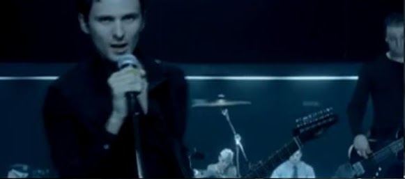
In our analysis into the Muse's other music video we found that a common theme within most of the music video's is the recurrence of multiple shots of the band playing their musical instruments. In the official music video for their song, 'Uprising' the band is featured on the back of a truck playing . Also in the music video for another of their songs, 'Starlight', there are multiple shots of the band playing onto of a large ship. Finally in another music video for the song, 'Time is Running Out', similar to the Starlight, features the band playing in a conference room, on top of a table. This a theme which runs through most of Muse's music video's and which in our music video, we have incorporated some shots of a band. Below are some screen shots of Muse's music video's demonstrating the repetition of the shots of the band playing their musical instruments. This is to make our music video more realistic for the Muse's band and to make it authentic. Finally the shots which are used of the band are varied and show a variety of different angles and shots which vary every time the band appear in the music video's. In our own music video for the song, 'Uprising' when we feature shots of the band, we have kept with the same idea of Muse's music video by using a variety of different shots and angles of the band. Also in many music video's including the official 'Uprising' music video they feature moments of lip synchronisation with the lead singer. In our own music video we have incorporated lip synchronisation with the lead singer to create links with Muse's own styles and theme's. The analysis of Muse's official music video's has helped us to create our own as we able to keep with the same principles and theme's which make Muse unique but we were able to incorporate our own idea's and blend them both together.

This is a screen from Muse's 'Uprising' music video
demonstrating a shot of the band.
This is another screen from Muse's 'Time is Running
Out' music video demonstrating again, a shot of the
band.
Theory research
Antonio Gramsci theorised hegemony, which shows the media encouraging people to consent status through powerful structures. Antonio was a Marxist social philosopher who lived in Italy. Because he was a Marxist he also theorised that societies must transform over time from economic systems to more liberating ones until society reaches state of communism.
The Marxist also believed that capitalism was an oppositional economic system due to the unequal distribution of wealth among few powerful people and he believed that eventually the masses would overthrow capitalism and move to less oppressive system. The system would overthrow economic systems.
According to his theory the public can’t maintain power from these systems alone. People would have to take control in order to keep the powerful people on top. Everyday behaviours keep society powerful such as being patriotic and celebrating the country’s pride and dedication. Gramsci also believed that the media had a key role in teaching people to do things in their everyday lives that support power towards society. People in the present would consider the media support through power structures such as society, capitalism and patriarchy.
Gramsci also created a counter hegemonic theory that it questioned traditional roles of characters and themes. His theories have become an important role of discipline and distribution around the world. This concept had contributed a valuable vocabulary for discussing the relationship between media and societal power.
Overall our group believes that the theory will work well with our music video because our ideas linked to contrast of power and dominance allowing a stronger and disciplined structure. This will also provide political views over the arguments of the lower and higher classes towards society and government.
Costumes
For our music video we chose the costumes for the different characters in order to highlight major stereotypes in our society so that the audience would be able to easily identify the characters. These stereotypes play a significant role in our storyline in our music video. It was vital that the audience would be able to identify these characters and what they stood for quickly. For our upper class character we chose stereotypical, upper class clothing in order to symbolise wealth and prosperity. The costume for the upper class character is as follows; shirt, black trousers and black shoes. This is stereotypical attire for a upper class person to wear and which in our music video highlighted that the character was upper class. The costume shows and demonstrates the characters sophistication and honour.
For the Lower class two characters, similar to the previous character, we chose stereotypical clothes which an audience could easily associate with the lower class culture. The lower class characters wore; A hooded sweatshirt, jeans and trainers. These are stereotypical clothes wore by the lower class. It highlights qualities of the lower class such as the hooded sweatshirt is know to be associated with thieves and anti social behavior as their identity is hidden. Finally the uniformity of having similar costumes for both lover class characters will create a connected identity for the lower class, like a collective consciousness to up rise and rebel against the upper classes. The stereotypical costumes of the characters also make it easier to make the link between our music video and the sociology theory, Marxism, created and founded by Karl Marx. This will have our music video solidly grounded in sociological links to create a larger meta narrative and deeper meaning.
Subscribe to:
Comments (Atom)